While small single-family houses fill the portfolio of most Japanese architects, studios are also getting a chance to build on a larger scale, where they compete against the design and construction service provided by large construction companies. This selection of highlights from recent non-residential projects in Japan demonstrates an architectural flair for spatial and technical innovations, rather than an emphasis on tradition. Nonetheless, this is work that requires skilled craftsmanship, resulting in immaculate explorations of crystal-clear concepts finished with perfect details.
Riken Yamamoto + Field Shop - Fussa City Hall, Fussa, Tokyo
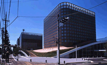
Riken Yamamoto's new Tokyo city hall is a piece of grand public architecture. The large ground floor Forum is a flexible space housing public service counters covered with a publicly accessible Hill Park. The gently undulating topography of the park acts as a structural shell, which is punched through by the two pre-cast office towers. Their bases connect with the park via a fluid and inspired 'skirt' detail, a flowing form finished in the same square tiles as the towers.
Photographer: Mitsumasa Fujitsuka
Chiba Manabu Architects - Weekend House Alley, Kamakura, Kanagawa Prefecture
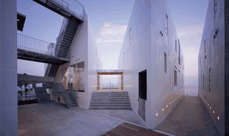
Weekend House Alley is a small beach development designed as a shared beach house for surfers. Instead of making one new outsized structure, architect Manabu Chiba has cut the building into separate triangular volumes by means of seven alleyways. As a result, he has kept the charm of the small-scale residential neighbourhood with a mix of 6 shops, a restaurant and 13 apartments, all bringing life to the seafront of Kamakura Beach after surfing hours. Residents and passers-by have 24 hour access to the new public alleys, and there are views to the stunning beach, ocean and mountains in all directions.
Photographer: Nacasa & Partners Inc
Akihisa Hirata & Yoshihiko Yoshihara - Sarugaku, Shibuya ward, Tokyo
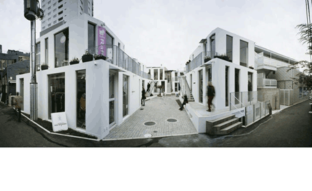
Sarugaku is a conglomeration of six individual tenant buildings that each contains three small shops. By stacking the shops on top of each other with a slight setback, Hirata and Yoshihara made a shopping-valley in-between the individual buildings. This small-scale project connects smoothly to the surrounding commercial neighbourhood of Daikanyama, turning the 'valley' into a lively configuration of people and shops, just like the streets of Tokyo. The many apertures in the shops are placed so that sightlines can overlap with the entrances and the display windows, allowing views to cross the valley and enter through the different volumes.
Photographer: Nacasa & Partners Inc
Toyo Ito & Associates - Tama Art University Library (Hachijoji campus)
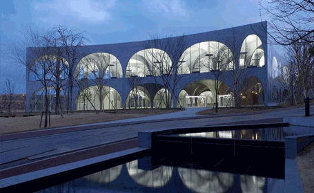
Toyo Ito's new library is an example of outstanding campus architecture, thanks to the ingenious structure and spatial organization. His preliminary design for an underground space was eventually raised above ground; turned upside down, the scooped out volume adopted the arch as the best way of dividing up the space, while simultaneously articulating the exterior of the building. The sloping surface of the ground floor, used for exhibitions, plays and dance performances, stimulates creativity, according to the architect. The most challenging technical element to construct was the 20-centimetre thin curved walls, which contain steel plates for reinforcement in the middle and specially curved glass to keep the façade clean.
www.toyo-ito.com
Photographer: Ishiguro Photographic Institute
Akira Yoneda / Architecton - K-Clinic
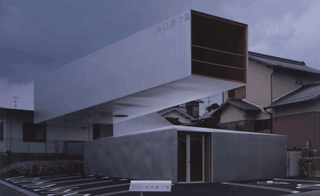
For realizing this unusual-shaped skin clinic architect Akira Yoneda enlisted the help of no less than Ove Arup Japan. The collaboration resulted in a 16-meter cantilever that can withstand the country's strict earthquake regulations. The doctor’s study is hidden inside the upper volume of the cantilever and articulates the straightness of the road. The base contains the clinic’s practice and expresses the former incline of this newly-built housing area. The building is divided into the two main volumes, the steel cantilever and solid base, with a steel neck connecting the two. To keep the structure from flipping over, an enormous concrete slab was laid to serve as the counterweight.
www.architecton.co.jp
Photographer:Koji Okumura
Atsushi Kitagawara - Nakamura Keith Haring Collection Art Museum, Kobuchizawa, Yamanashi prefecture
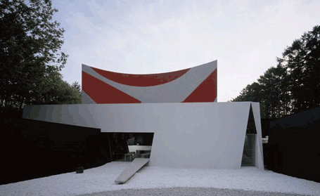
Located at the foot of the Southern Japanese Alps in Kobuchizawa, Nakamura Keith Haring Collection Art Museum is the only museum in the world entirely dedicated to the works of the American Pop Art artist Keith Haring. In this peaceful setting, the art has been taken out of its original context - the underground scene of 70s and 80s New York. The route through the museum is based on collector Kazua Nakamura's personal story, with the artwork arranged according to allegorical metaphors like ‘Chaos’, ‘Giant Frame’ and ‘Dream’. The route ends on the roof terrace with a view on the surrounding mountains, bringing the visitor back to reality.
Sambuichi Architects - Nonoyama Orthodontic Clinic
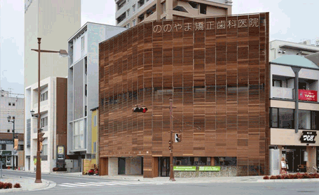
Architect Hiroshi Sambuichi tackles designs only after undertaking thorough research on the location. For this orthodontic clinic-cum-private residence he has attempted to get optimal use of geothermal energy and sun energy sources. The end result is a charming structure with an intelligent double skin façade that ensures the necessary fresh air, sunlight, and economic savings for the patients. The façade is clad with hardwood slats, fixed at different angles to function as both rain- and sun screen. The result is an `active` double facade with several gradations of openness that will ultimately be filled with ivy, watered by harvested rainwater.
Photographer: Daici Ano
Junya.ishigami + associates - Kanagawa Institute of Technology KAIT Workshops, Atsugi, Kanagawa Prefecture
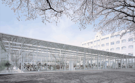
KAIT Kobo is a studio space for student’s activities on Kanagawa Institute of Technology `s campus grounds. With the idea of making an astronomy map Ishigami placed 305 columns, each with unique dimensions and a different position, to make an extremely ambiguously divided space without any fixed perimeters. The columns have longitudinal sections. Depending on their angle of orientation, the effect they produce is of a wide open or a somewhat closed interior. Someone walking around in the building sees a different space as his viewpoint changes. With this Ishigami gives people choices as they move through the building.
The article is republished with permission from Wallpaper.com
