Today we've introduced a change to the Fridae user menu.
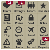
When we updated to our current site design, we used a 4x4 grid of icons to convey menu options and action information:

This presented us with a few problems:
- Adding new menu items was problematic - we could only add 4 buttons at a time!
- The graphics contained the text in whichever language is needed. For future translations, we need to create new graphics.
- Because of size restrictions in the design, the text in the graphics was quite small - almost too small to read.
- Users are often confused by the numbers added to the icons - we never really explained the difference between red and blue tabs very well.
I think it's safe to say that we were really going for a menu design reminiscent of an iPhone home screen, but we didn't quite achieve what we wanted.
With today's updated menu, we hope to address these issues.

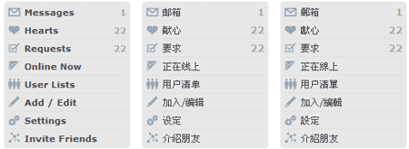
Our new menu is simpler and easier on the eye - it's a better match for the site's color palette, and as a straight top-down vertical layout it's simpler to comprehend.
We grouped menu options into functional areas, many of which expand to provide additional options when clicked:
- Actionable items (ones that require an action or response from you) - messages, hearts and requests - remain at the top.
- Lists of users - friends, favourites, tracks, blacklist, etc - follow, with a separate section for your friends and favourites currently online.
- Tools for modifying your profile and related data are next (Add/Edit) - you can find options to jump directly to new Travel Plans and Blogs, and finally an option to manage Directory listings.
- Next you'll find Settings - preferences related to your account and how you use Fridae. You no longer need to click through to an interim page to see all the options in this area.
- Finally, we've added a link to our new Referral System - we'd like you to invite your friends to come and join you on Fridae! (if you didn't already know)
We'd like your feedback on the new menu design and layout - did we do something wrong? Did we do something right? Click here to contact us and let us know what you think, or add a comment below!
PS: If the new menu's a bit confusing, you can click on the  icon below the menu to switch back to the original menu. You should let us know your thoughts, though - we don't plan to keep the old menu around for long. :)