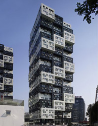
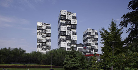
The Bumps complex on the Chaoyang District of Beijing was designed by Sako Architects, headed by founder Keiichiro Sako. During the time of our shoot, the final touches were added on the development.
 Image from Wallpaper
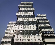
The project integrates residential and commercial uses in a square-shaped layout, rotated at 45 degrees off the city’s north-south axis. The design, which developed over a year’s time, cleverly moves away from the conventional straight-lined skyscraper, an approach, which not only adds to the building’s dramatic effect but also secures plenty of direct sunlight and stunning views for every one of the individual flats.
The tall complex consist of four towers of piled boxes housing the various activities, connected by a series of terraces and lower buildings on the near-ground floor level. The residential ones reach 80m in height, while most of the setback areas are used for terraces, also including a restaurant on the 6th story of one of the commercial towers.
The interior is equally stylish and geometric, continuing the exterior black and white theme, but also showing off the building’s reinforced concrete construction and stone walls, enhanced by carefully planned lighting and interior design.
 Image from Wallpaper
Alternating crisp black and whites and showcasing its striking stacked cantilevers, from the base to the very top of the project, the award-winning Bumps building is one of the most impressive new developments in the Chinese capital.
The article is republished with permission from Wallpaper.com


 列印版本
列印版本


讀者回應
Its tacky.
http://www.inhabitat.com/2009/08/20/habitat-67-montreals-prefab-pixel-city/ Both concepts borrow from the Bauhaus school, itself inspired by modernism, reconciling mass production with creativity. What appeals to me about the Bumps is that I used to play with Lego as a boy, imagining each brick to be an apartment unto itself. I see I'm not the only child to think that way, nor - as this new design of an old idea suggests - was I the last. Thank goodness someone's still funding "the different."
請先登入再使用此功能。