Test 2

Please select your preferred language.

請選擇你慣用的語言。

请选择你惯用的语言。

English
中文简体
台灣繁體
香港繁體

登入

記住我

初到 Fridae?

Fridae Mobile

Advertisement
Highlights

More About Us

新聞&特寫

« 較新的 | 較舊的 »
7 Dec 2010

Clover House, Japan

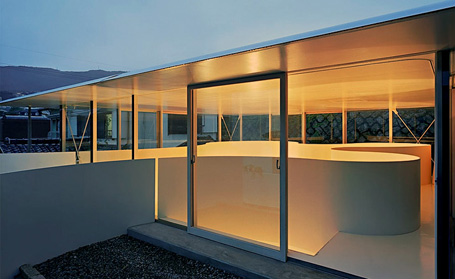
The Clover House by Katsuhiro Miyamoto: a classic slice of Japanese house design, bringing spatial ingenuity to a restrictive site. 


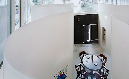
The Clover House represents a classic slice of Japanese house design, bringing spatial ingenuity to a restrictive site with an unconventional internal layout. Designed by Katsuhiro Miyamoto, the house is named for the clover-shaped element at the heart of the square site plan.

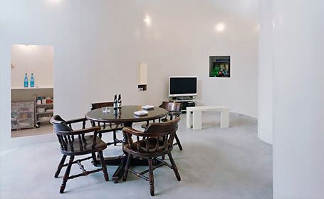
Made up of a recently excavated basement level, beneath a glass-box roof, the house has generous over 4m-high ceilings. Within this central atrium space sits the clover, a flowing ribbon of wall that subdivides the interior into a series of small functional cells - a bathroom, study and kitchen – as well as a small staircase leading up to a mezzanine. The curved walls extend upward to act as a balustrade for this upper-level space, which also benefits from the floor-to-ceiling windows of the glass box.

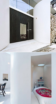
The architect cites traditional Chinese underground houses as his architectural reference, pointing out that the 'loft alcoves' created by the leaves of the clover make ideal private, well-screened-off bedrooms that fully maximise the space on this small site.
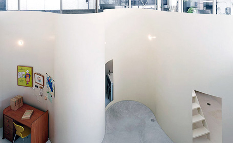
The article is republished with permission from Wallpaper.com 

讀者回應

1. 2010-12-07 21:39  
nice idea and concept. Out of the box. I like it. Hope can get one for my private. :)
回應#2於於2010-12-08 06:33被作者刪除。
3. 2010-12-08 15:02  
好美哦!喜欢!
4. 2010-12-08 20:11  
This is absolutely stunning. Love how e walls give off an endless feel! Very novel idea(:
5. 2010-12-11 12:28  
hmmmm i think if i were to live in that house...and come home drunk....i would not know where my room is....
6. 2010-12-12 22:04  
nah don't get it
7. 2010-12-13 15:40  
what the hell???. boring
8. 2010-12-19 14:24  
“Develop imagination, throw away routine,” (Gordon Selfridge). It's certainly been accomplished here. BRILLIANT!
9. 2011-01-01 01:57  
i love the fact that the walls have little or no edges. it's fantastic =D always wondered what it would be like to sleep in a circular(circle shaped) room. and what height!!
10. 2011-01-25 16:59  
good idea and concept.. love it
but i don't like the roof
11. 2011-01-31 13:58  
Dont like the living room, it looks so uncomfortable to watch tv there. The dining set is another thing that is out of place. That set for a tavern maybe...
12. 2011-04-13 08:52  
Stylish? Not quite. The interior and furnishing is 3rd grade.
Novel? Only for first 5 to 10 minutes.
Will I live in it? No way~!
The house looks and feel poor in spirit and cold. The entrance door is very unique though, but once pass the front door, it's like living in a funeral parlor.
13. 2011-04-19 03:44  
and what is going on with the space between the box and the 'clover' walls in the ground floor? is there something there?

請先登入再使用此功能。

請選擇新聞及專欄版本

精選個人檔案

Now ALL members can view unlimited profiles!

Languages

View this page in a different language:

讚好

合作夥伴

 ILGA Asia - Fridae partner for LGBT rights in Asia IGLHRC - Fridae Partner for LGBT rights in Asia

Advertisement